After the fall of the Roman Empire, architecture of the middle ages eventually strayed from classical design principles. Emphasis on lightness and height, gave way to the birth of Gothic architecture, ultimately becoming the new style for the era. Even though the building had its vulnerability because of its support being exposed its immense structure consisted of huge stain glass windows. Everything about gothic architecture was in respect of Christianity. Being commissioned by the church most décor was dictated to religious purposes often depicting scenes from the bible, all intended to cast a sense of humility before the glimpse of the heavenly kingdom. The pinnacle achievement most associate with gothic style perhaps because of Disney or the iconic sense from the film the hunchback of Notre Dame is the Cathedral in Amiens, France. The 1400’s were a busy time for the Italians. Italy became the rebirth of antiquity. The Renaissance awoke the classics. Greek and Roman influence shifted the gothic mentality from religious centrality, to the wonder and curiosity of man’s place in the cosmos. Villa Capra one of the most duplicated buildings in the world by Andrea Palladio embraced the urban culture and reached the artistic heights they set out for. Moving forward to the Baroque period and age of drama and theatricality came; a complex style of architecture that took on the principles of stimulating the senses. With the impending reformation of the church much was intended to keep congregations put. The often outrageous style of Louis XIV’s palace at Versailles was designed to antimidated and displays the power and authority of the king. The pursuit to claim our own individuality as an architect drives us to designs that breach the conventions of the here and now, always pushing us forward to tomorrow. The alternative will always be that elusive forbidden fruit that only some dare to attain. Without the path there is no goal the journey defines the architect not the rules.
Thursday, October 21, 2010

Friday, October 15, 2010


Thursday, October 14, 2010
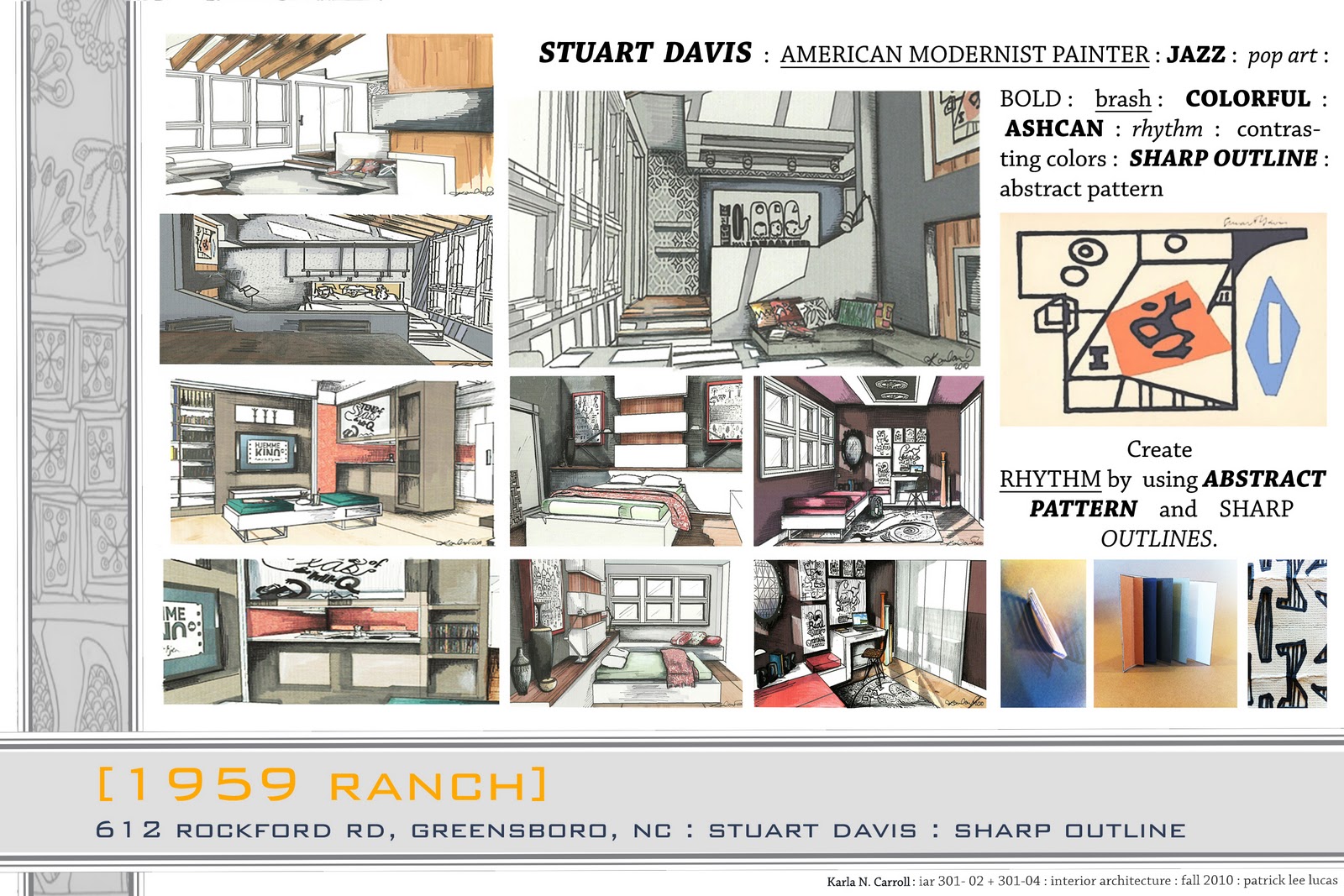
[RANCH : PROCESS WORK]
MY IDEA:
Create RHYTHM by using ABSTRACT PATTERN and SHARP OUTLINES.
Stuart Davis was best known for his jazz influence to create proto pop art paintings. By using his passion for Jazz, I want to create pattern that resembles a musical movement. The pattern denotes order; the sequence of the order is what creates the pace or beat of the rhythm. Element placement in the space is very important for my design. The elements placed in the composition are going to guide the viewer’s eye throughout the space. Following a regular arrangement or reproduction of elements in the art work, patterns and furnishings will create rhythm.
[LIGHT]


[RANCH: ABOUT THE ARTIST]
Inspiration image

Stuart Davis
He was an early american modernist painter. He was best known for his JAZZ influence to create proto POP ART paintings.
His work was bold, brash, and colorful. ASHCAN pictures were the signature to his work.
What is POP ART?
Pop Art focused on everyday objects that were rendered through an adoption of commercial art techniques. Pop removes the material from its background and cuts off the object, or combines it with other objects, for contemplation.
What is ASHCAN?
ASHCAN is a realistic artistic movement that became famous in the US during the early twentieth century. Ashcan work is works that portrays scenes of daily life in New York's poorest neighborhoods.
http://en.wikipedia.org/wiki/Ashcan_School
Analyzing his art work
- Forefather of the Pop Art movement.
- Abstraction
- Subjects come right out of the Jazz nightclubs
- Squiggly lines and flashy colors.
- Painting soap boxes, billboards and gas pumps with a tongue-in-cheek wit that was ahead of his time.
http://www.sullivangoss.com/Stuart_Davis/
Repetitive rhythms
RHYTHM represents the easy movement of the viewer's eyes following a regular arrangement or reproduction of elements in the art work.
There are many different ways to move the eye through a painting. The artist needs to do this so the viewer will appreciate the painting as a whole and while doing so they can stimulate the viewer in a certain way.
Contrasting colors
Two colors from different segments of the color wheel are contrasting colors.
From example:
Red is from the warm half of the color wheel and blue is from the cool half. They are contrasting colors. You may also see these referred to as complementary colors which generally refers to each of a pair of colors that are directly are almost directly opposite each other on the color wheel.
Sharp outlines
Dark lines outline object.
Abstract patterns
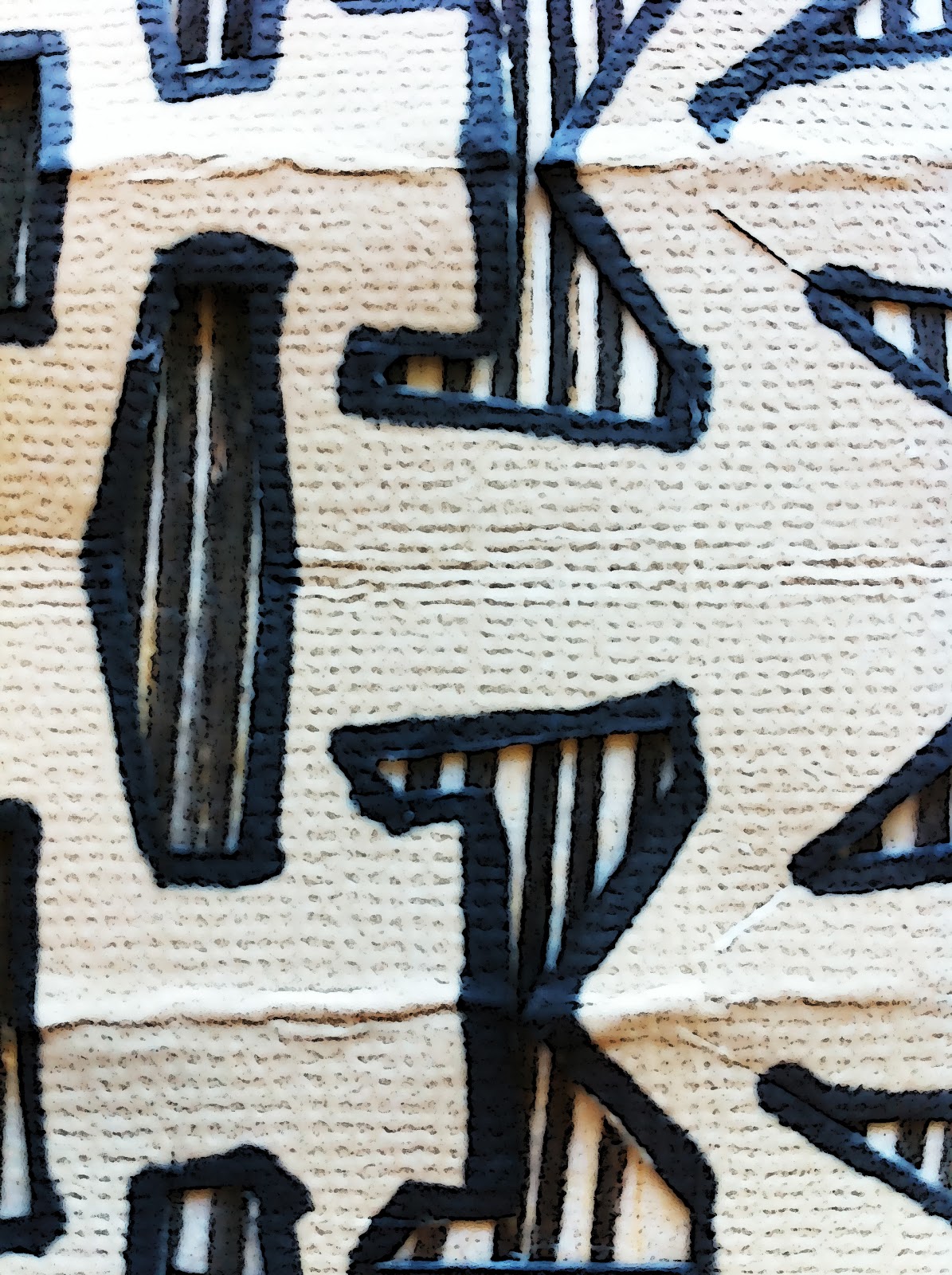
Abstract patterns in Stuart Davis’ work included lettering which was inspired by advertisement posters.
More of his work

Tuesday, October 5, 2010
[BUNGALOW]
“A house that gives the body all the fresh air that is needed, that provides for the right temperature and that reduces labor to a minimum; a house that will keep the mind tranquil and rested without jarring on one’s feelings for beauty.”
-- Lionel Robertson and T.C. O’Donnell
The bungalow, characterized as a home built with the same quality and attention to detail as those twice the price, provides a practical and clean-lined residence, one that contains beautiful attention to detail and custom built-ins. According to Clark, these dwellings represent “a miracle of simplicity and efficiency.” This simple bungalow dining room reflects contemporary design and structure. Borrowing on the Arts and Crafts traditions, strong lines softened by circles, round edges, large graphic patterns and contrasting textures, provide links to the past.
The simple and multi-functional sideboard serves as a great place to display artwork, collectibles, and doubles as a storage unit. As a place for people to gather for family meals or as a place to host a festive dinner party, the dining room expands and contracts to suit the size of the occasion. When the users need six chairs to accommodate all guests, they remain at hand. But, when smaller gatherings necessitate the need for less furniture, the sideboard turns into a storage unit onto which the host can store four chairs in the unit, two on each side, thus adding depth to the room and interest to the decor. According to Bachelard, this double meaning for objects allows us to layer memories on them and imbed them in our everyday places.
Complementary accent colors tie the room together. The energy of bright yellow and cerulean blue serve as welcome companions to soothing gray and creamy white. Contemporary accessories such as bowls, hardware, ceramic vases, embossed metals, art, and accent pieces make the room more inviting.


Subscribe to:
Posts (Atom)